I ran across this post yesterday. It’s a blog post by Jared Flood talking about color choices. This made me think a bit about my Color Affection shawl.
Jared talks in his blog about hue, or color, and value as the two important concepts to look at when choosing several colors that will go together in a project. Obviously the colors that you choose are important, they need to “go” together in some fashion that is pleasing.
The value concept was newer to me. If your colors are all great choices, but their values are too similar, your finished piece might be a muddy mess instead of having the colors pop out individually. Jared recommends using your digital photo application to convert a color photo to greyscale to illustrate this and to test your choices.
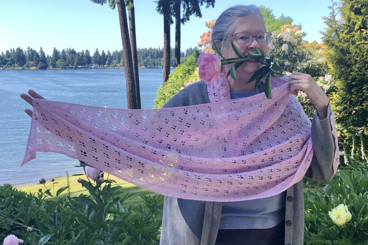
Here are my colors for my current Color Affection.

And what that looks like knitted up so far.

Here are the same photos adjusted in Lightroom to black and white.


Not bad, but there could have been a little more difference between the two lighter values. With stripes, I think it’s OK, but with a complex stitch pattern, those two light colors would just blur together.
Here’s the other color scheme I had contemplated for this shawl.


I don’t think that would work as well. And it definitely wouldn’t work in something like the yoke of an Icelandic sweater.
What do you all think? Is this something you’ve run into in your knitting? And do go read Jared’s post, and the follow up post that goes into much more detail.
Color value is hugely important in the mixing process, and I think Jared has a great way of checking choices. Honestly, your choices for Color Affection work well, IMHO. Much better than “not bad”!
I think it is a good way to vet color choices. Mud isn’t attractive, or even less so, that feeling that it doesn’t work but not being sure why, and persevering.
Thanks for referring us to Jared Flood’s blog posts. The last two on color theory were most interesting and stuff I’d never heard of before. I will definitely take value into account with my color choices from now on!